I love using warm, earthy reds to bring hearthlike energy to busy kitchens without yelling for attention. Use a single bold element—a red island, hood, or bank of cabinets—or scatter small pops like tea towels, a painted pantry door, or enamel pendant lights.
Pair red with warm woods, cream neutrals, and brass or matte black hardware. Choose matte finishes and sealed surfaces for durability, and swap textiles seasonally for easy refreshes; keep going to see practical how-tos.
When to Choose Red for Your Kitchen

When should you pick red for your kitchen? I choose red when I want warmth, energy, and a cozy hearthlike feel that sparks conversation.
I recommend it for active family kitchens, rustic cottages, or small breakfast nooks needing a focal wink.
Use red sparingly—accents, a painted door, or cookware—to enliven without overwhelming, balancing with natural wood and soft neutrals.
Consider building a cohesive palette by coordinating red accents with natural wood tones and soft neutrals to maintain harmony.
Which Red Shades Work Best in Kitchens

I favor warm, earthy reds in kitchens because they bring a hearthlike glow without shouting for attention.
I lean toward tomato, terracotta, and muted brick tones—each feels cozy and inviting.
Deep cranberry works for cabinets; soft rust suits walls or accents.
Pair reds with warm woods and cream to soften boldness.
These shades energize yet remain comfortably grounded.
Organic brown palettes can add layered texture and balance to a red-focused kitchen, creating a grounded, cohesive look with earthy texture.
How Texture Changes a Red’s Feel

Layering texture changes how a red reads in the room, and I often rely on that to dial mood and warmth. I pair finishes to soften or sharpen reds—matte soothes, gloss energizes. Try tactile mixes to shift vibe:
- Linen curtains for calm contrast
- Distressed wood for cozy depth
- Polished metals for punchy sparkle
Those swaps make red feel lived-in or lively. Mixing vintage charm with modern kitchen functionality can help balance bold color choices with practical design, especially when you combine distressed wood with contemporary fixtures.
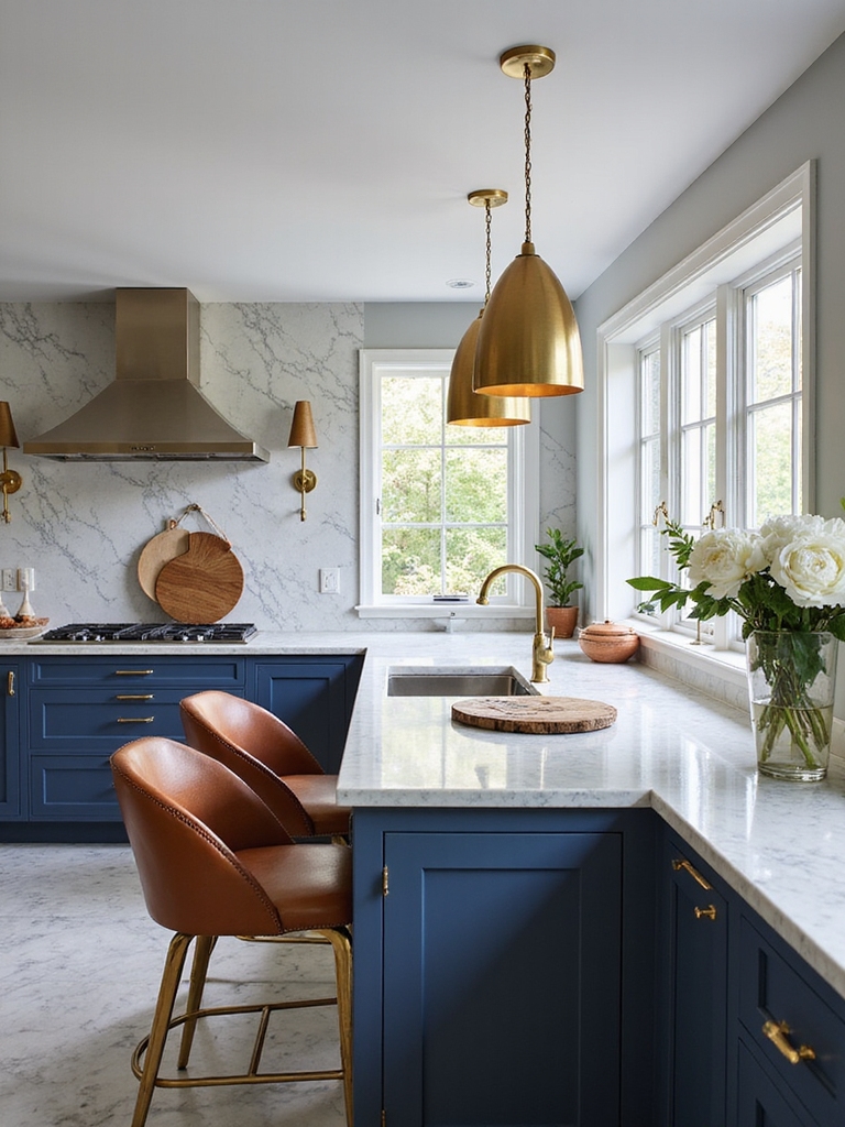
Red Focal Pieces: Islands, Cabinets, Hoods
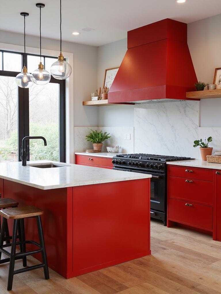
After playing with textures to soften or sharpen red, I look for a single bold element to anchor the room — a red island, a bank of cabinets, or a show-stopping hood.
I favor aged finishes, chunky hardware, and simple lines so the color feels lived-in, not flashy.
That focal piece sets the tone; everything else stays quieter, warm, and inviting. Elevated kitchen islands often serve as the centerpiece in luxury homes, with island styling reinforcing the room’s design language.
Small-Space Red Tricks for Galley and Compact Kitchens

I like using red to make a small galley kitchen feel intentional rather than crowded.
Tall, narrow shelves or a painted trim draw the eye up and keep the floor feeling open, and tiny pops—like a kettle or spice jars—deliver big impact without overwhelming.
Let’s look at simple, scaled ideas you can try in your own compact space.
Designing with scale and vertical lines can create a sense of height and openness in confined areas, such as using tall, narrow shelves to emphasize vertical space.
Scale With Vertical Red
When I’m working with a narrow galley or a compact kitchen, I rely on vertical red accents to stretch the space visually and bring warmth without crowding the countertops.
I suggest simple, rustic touches that rise up rather than sprawl.
- Red open shelving to draw the eye upward.
- A tall pantry door painted faded red.
- Narrow red tile backsplash strip running vertically.
Designers often style the top of cabinets with decorative objects and greenery to create visual interest and balance; consider adding a row of low-profile accents or open shelving above cabinets for a cohesive look.
Small Pops, Big Impact
Pulling vertical accents up the wall is great, but you can get almost the same cozy punch in a galley by inserting small, well-placed red touches that don’t eat into work surfaces.
I favor red dish towels, a slim spice jar, a painted stool, or a magnetic knife strip with red handles. These bits warm the room without crowding it, keeping function first.
Consider adding a compact red appliance or accessory to create an intentional focal point and tie the palette together with high-impact kitchen counter decor.
Red Backsplashes: Bold Looks That Clean Easily
Because I love kitchens that feel lively without fuss, I reach for a red backsplash whenever I want a bold focal point that’s also practical.
I choose finishes that wipe clean and age well, pairing warm wood and simple hardware.
- Glossy subway tiles
- Matte porcelain slabs
- Easy-grout mosaics
They resist stains, brighten corners, and feel happily rustic. I also like to consider textured backsplash options to add depth and character to the cooking area.
Lighting Choices: Red Pendants and Bulb Temperature
I like using red pendant lights to add personality and a focal point over an island or table, whether they’re industrial metal, hand-blown glass, or simple enamel shades.
I’ll talk about choosing bulb color temperature so the red tones read warm without making the room look too orange or too flat.
I’ll also cover dimming and smart controls so you can shift the mood from bright prep light to cozy evening glow.
Red Pendant Styles
I’ll start by saying that choosing red pendant lights can instantly anchor a rustic kitchen, and I like to think of them as both jewelry and workhorse — they add color and define task zones.
I favor simple shapes and patina finishes. Consider these styles for warmth and function:
- Farmhouse enamel
- Industrial metal
- Hand-blown glass
Bulb Color Temperature
When you pick a bulb for your red pendants, think about the mood you want to set — I usually aim for warmth and clarity over glare.
I favor 2700–3000K for cozy, inviting meals and 3000–3500K when prepping food needs crisper detail.
Choose bulbs with high CRI so reds stay rich, not muddy, and let the fixtures themselves feel handmade and honest.
Dimming And Controls
Having the right bulb warmth is only part of the story — how you control that light makes a big difference in how the red pendants read through meals and tasks.
I prefer simple, tactile controls that shift mood and function:
- Dimmer for evening warmth.
- Zoned switches for prep vs. dining.
- Smart scenes for effortless ambiance.
Those choices keep the red lively, not overwhelming.
Seating & Surfaces: Red Barstools, Cushions, Countertops
Because I love a kitchen that feels lived-in and lively, I reach for red seating and surfaces to anchor the room with personality and warmth.
I choose sturdy red barstools with patinaed metal or worn wood, and soft cushions in barn‑red linen for comfort.
A matte red countertop or butcher block edge adds charm, tying together rustic textures without feeling fussy.
Hardware Choices: Red vs. Red‑Adjacent Finishes
I weigh the small, practical details of hardware the same way I choose a favorite mug—by how it feels in my hand and how it complements the rest of the kitchen.
I prefer red knobs for sparks, muted terracotta for softness, or hammered copper for warmth.
- Red: punchy, playful
- Red‑adjacent: earthy, subtle
- Copper: rustic, tactile
Pairing Red With Neutrals: White, Gray, and Warm Wood
When I pair red accents with neutrals, I choose each element like a note in a song so the room feels balanced, not shouty.
I tuck cherry bowls and red tea towels against crisp white walls, layer soft gray textiles for calm, and let warm wood—open shelves, butcher block—anchor the space.
The result feels cozy, lively, and thoughtfully composed without overwhelm.
Pairing Red With Metallics: Brass, Chrome, Black
Pairing red with metallics lets me move from the soft, homey feel of neutrals into something a bit more polished without losing warmth.
I love mixing finishes to add character:
- Brass for vintage glow and cozy contrast.
- Chrome for bright, modern punch.
- Matte black for rustic edge and depth.
These combos keep red lively while feeling grounded and inviting.
Durable Finishes and Kitchen Maintenance Tips
Think about finishes you can live with day after day—I’ve learned that choosing durable surfaces saves time and keeps red accents looking fresh.
I favor matte lacquer on cabinets, sealed wood for counters, and textured tiles that hide wear. Wipe spills promptly, use gentle cleaners, and reseal wood annually.
These simple habits preserve vibrant red touches and keep the kitchen feeling cozy and lived-in.
Budget-Friendly Red Updates You Can DIY
Keeping finishes in good shape makes larger projects less urgent, so I like to focus my energy on small, affordable updates that bring red accents to life.
I’ll share quick DIYs that feel cozy and honest:
- Paint a pantry door barn-red for instant warmth.
- Add red ceramic knobs on cabinets.
- Stitch simple red linen tea towels for rustic charm.
Removable and Seasonal Red Accents for Renters
I lean into seasonal touches that I can swap out in a weekend, so renters don’t have to compromise on a cozy, red-filled kitchen; simple swaps keep things fresh without risking a security deposit.
I choose removable peel-and-stick backsplash tiles, adhesive hooks for festive wreaths, red textiles—tea towels, seat cushions, runners—and portable accents like ceramic pitchers or mason-jar herb planters that store easily between seasons.
Common Mistakes to Avoid When Adding Bold Red Accents
I’ve learned the hard way that too much red can overwhelm a cozy kitchen, so I always recommend pacing your accents.
Watch scale and proportion—small pops and large swathes call for different treatments so nothing feels out of place.
And don’t forget function: place bold pieces where they won’t block workflow or wear out quickly.
Overpowering With Too Much
Although bold red can bring warmth and character, I’ve seen kitchens tip from striking to screaming when accents overwhelm the space.
I favor restraint; a thoughtful touch keeps charm without chaos.
- Limit red to focal spots.
- Balance with neutrals and textures.
- Edit items—less is livelier.
Trust your eye; small, well-placed pieces sing in a cozy, rustic kitchen.
Ignoring Scale And Proportion
When you pick a red accent, don’t ignore how it reads against the room’s scale—I’ve learned the hard way that a too-large splash of red can feel clumsy while tiny bits vanish.
I now match proportion to space: a bold pendant over an island, modest dishware on open shelves, or a narrow runner along a galley. Balance keeps warmth without overwhelming the rustic charm.
Forgetting Functional Placement
Because a striking red piece should do more than look good, I always check how it will actually be used before I bring it home.
I hate when beauty gets in the way of chores, so I prioritize placement. Consider practical spots:
- Near prep zones for visibility.
- Away from heat or splash areas.
- Within easy reach for daily tools.
That keeps charm and function together.
I hope this guide sparks your confidence to bring bold red into your kitchen — remember, “measure twice, cut once.”
I’ve shown you when red works, which shades and textures flatter different layouts, and how to keep finishes durable and renter-friendly.
Start small if you’re nervous: a red kettle or movable island can change everything. Trust your instincts, embrace warmth, and have fun — a little color goes a long way in making your space feel alive.